Red Axe Covers #6: Barking Up the Right Tree (2015)
"I sought refuge in words that allowed me to feel connected and began to write my blog — a real ordinary carer, not a part of any party or any political organisation, like a wee ginger dug barking from the sidelines. And I discovered I was not alone. A thousand dugs barked that summer." — Paul Kavanagh
In our sixth instalment of Red Axe Covers, Mark Mechan (of Red Axe Design) discusses his cover design and illustrations for Scottish political blogger Paul Kavanagh's book, Barking Up the Right Tree (now available for purchase).
The brief for Barking Up The Right Tree — a project that we first called “Wee Ginger Dug” — was as simple as you could hope for: publisher Allan Cameron's sole instructions were, “If you have a dog [on the cover], it has to look like his one.” Once the book found its full title, I was off and running.
This book was to be a straightforward collection of political rants/observations. The cover was needed in something of a hurry so this was to be simple. Dog. Barking up a tree.
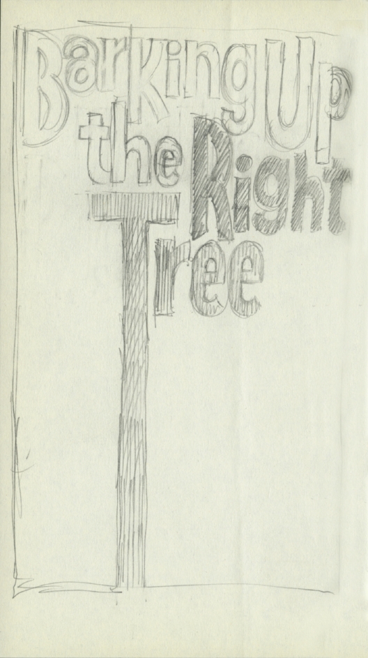
I felt that perhaps instead [of drawing an actual tree] the title itself could form the tree and I set about creating a fun, friendly and lively arrangement suitable for barking up.
Having done a few pet portraits in the past I was aware that people are often more attached to their pets than to their spouses or children, and are usually more demanding when it comes to a likeness. The problem with portraits (pets or human) is that the person commissioning doesn’t often grasp that the portrait will only be as good as the photo provided. So my initial problem was not so much the layout of the cover as getting the dog's look correct.
Getting Ginger the dug's look was paramount, and after some unsuccessful attempts it was necessary to request more detailed photographs of the "deeply uncooperative"(but presumably easily bribed) dug.
I had a photo of a wet-nosed wee mongrel looking plaintive, and consequently the sketches I turned out weren’t great. I did sketch after sketch of pretty much the only design I had in my head, and after a number of unsuccessful attempts I requested that Paul provide me with some fresh shots of Ginger (the dug) – and they had to be in profile. This apparently would be awkward as our hero (that's Ginger, not Paul) was “deeply uncooperative when it comes to photographs”.
Presumably Paul produced a juicy bone with which to bribe dug as a set of excellent photos arrived in my inbox and I could at last try for a decent likeness: shorter and greyer snout, shorter neck, slightly wider around the middle, ears down, and a few other tweaks. Phew. This one passed muster.
A set of excellent photos arrived in my inbox and I could at last try for a decent likeness: shorter and greyer snout, shorter neck, slightly wider around the middle, ears down, and a few other tweaks.
Trying to bring something creative to the design, after having drawn oor dug barking up actual trees in differing colours, and arrangements of typography around them, I felt that perhaps instead the title itself could form the tree and I set about creating a fun, friendly and lively arrangement suitable for barking up.
The completed cover:


