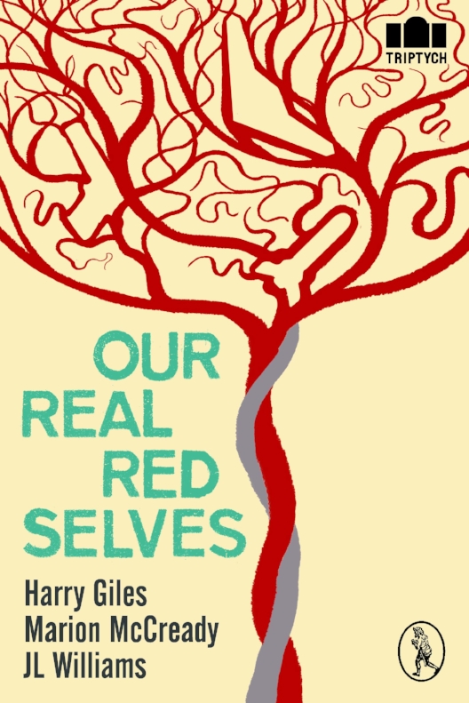
Red Axe Covers #3: Our Real Red Selves
In our third instalment of Red Axe Covers, Mark Mechan (of Red Axe Design) discusses his cover design and illustrations for Vagabond's first poetry Triptych: Our Real Red Selves, which is now available for purchase (click the title for more info, including a peek into the book).
The brief for Our Real Red Selves was simple: war and birth. Three poets taken together and linked with a very human condition: we are born with a natural propensity to violence.
Poetry is a tricky thing to get across in an illustration. It's not something that suits a literal approach, even if something literal is to be found amongst the words. But having an overarching concept to the collection made life easier. The question was, how do I come by a cover that sums up this theme?
War motifs are ten-a-penny, and when it comes to finding a symbol covering both creation of new life and the destructiveness of war it's hard to avoid finding fertile ground (pun intended). No shortage of phallic symbols in the machismo of missiles and gun barrels...
The thorny subject du jour of mechanised, unmanned warfare is symbolised in the terrifying shape of the eyeless carapace of the drone. War motifs are ten-a-penny, and when it comes to finding a symbol covering both creation of new life and the destructiveness of war it's hard to avoid finding fertile ground (pun intended). No shortage of phallic symbols in the machismo of missiles and gun barrels...
Gentler thoughts of birth, and the protection of the womb, the safety of being enclosed and unaware of what lies in wait, led me to look at the human placenta and its amazing and beautiful network of vessels.
But I needed subtle thoughts and not crass visual puns. So, gentler thoughts of birth, and the protection of the womb, the safety of being enclosed and unaware of what lies in wait, led me to look at the human placenta and its amazing and beautiful network of vessels. With the double-twist of the umbilical cord it forms an almost tree-like structure of filigree tendrils — and it came to me that I could use that structure to show, to the keen-eyed, that there is a tendency to war hidden in even our origins.
There is a recent trend in an area such as logo design for objects hidden within areas of negative space in an illustration.
There is a recent trend in an area such as logo design for objects hidden within areas of negative space in an illustration. A case in point might be the well-known FedEx logo with its arrow hidden within the typography, telling us of direction, delivery and dynamism. Often these symbols remain unnoticed, but they are there, subliminally, reinforcing the message the designer needs to get across. My lightbulb moment came while studying the structure of the placenta and finding numerous possibilities for hiding symbols of war within its "branches". Here was where I could hide my cluster bomb, my pistol and my stealth bomber.
Working purely digitally and armed with silhouettes of three war machines, I drew around the shapes and spun the vessels of the placenta to hide or reveal the weaponry. The result is simple but direct, and hopefully effective.
And the colour scheme? Of course, it had to be red.
The completed cover:


